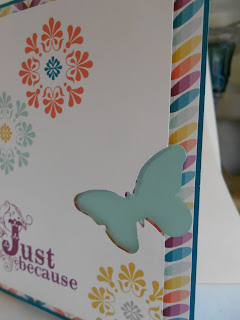
This one is to Emphasize the Negative. You always have a negative when die cutting on any machine, and sometimes it's nice to use the negative as I did on this Tim Holtz Movers and Shapers butterfly die. I've been wanting to do this on a card for awhile, and now is the perfect time! I let the die cut hang over the edge of my cardstock to sort of cut part of it off. I like that look. Then I die cut another butterfly in a coordinating cardstock to make it stand out. All of the 'stamped' images are digtial, as well as the background paper that I made in My Digital Studio from Stampin' Up!. Here is a close up of my use of the negative die cut.
Thanks for taking time to stop by today!


4 comments:
A wonderful card and such a good idea to use the negative cuts.
Yvonne x
This is brilliant, Pam!! I love those happy colors, and your use of that negative cut is terrific. Good luck in the challenge!
Fun technique, Pam! LOVE the way your negative image protrudes the front panel! And your color palette is so full of sunshine!
Hey Pam! Thanks for linking this up to the Emphasize the Negative Challenge in the Moxie Fab World! I'm so glad you joined in on all the fun! :)
Post a Comment